Understanding Phaser’s EXPAND scale mode
A game that runs on the web and in native store apps must look right on every screen it meets: a phone held upright, the same phone turned sideways, a wide desktop window, an iframe on a game portal, without black bars and stretched sprites.
It should also keep the same gameplay everywhere.
This post explains how to get there with Phaser’s Scale.EXPAND mode plus a camera zoom.
The idea fits in one sentence: let Phaser decide how many pixels the game has, and let the camera decide how big the game world looks in them. A small example follows at the end, but first the why and the how.
Why EXPAND and not the others?
EXPAND is the only mode that fills the whole screen without cropping and still guarantees a minimum resolution. Here is how it compares with the other modes that adapt to the screen:
| Mode | What it does | The catch |
|---|---|---|
FIT | Scales the game size to fit inside the parent, keeping its aspect ratio | Black bars whenever the screen shape differs from the game shape |
ENVELOP | Scales the game size to cover the whole parent, keeping its aspect ratio | Whatever sticks out is cropped, and you can’t know in advance how much |
RESIZE | Makes the game size equal to the parent size in CSS pixels | No reference size: a phone gives you 390 pixels of width, a desktop 1920, and every layout must cope with both |
EXPAND | Fits the base size like FIT, then grows the game size along the side with spare room, like RESIZE | None of the above: one side keeps the base size, the other is equal or larger |
As you can see, FIT wastes the screen, ENVELOP hides part of the game, and RESIZE gives up the reference size. EXPAND keeps the best part of each.
How EXPAND computes the game size
With EXPAND, the width and height in the game config are not the final game size: they are the base size. Our example uses 820 x 1000. On every resize, Phaser compares the parent element with the base size on each axis:
The smaller factor wins, exactly like FIT. The side it belongs to keeps the base size; the other side becomes the parent size divided by that factor, so it fills the parent instead of leaving a bar:
and the other way round when scaleY is the smaller one. Measured in a browser with our 820 x 1000 base:
| Parent (CSS pixels) | scaleX | scaleY | Game size (game pixels) |
|---|---|---|---|
| 1000 x 560, a short desktop window | 1.22 | 0.56 | 1786 x 1000 |
| 390 x 760, a phone held upright | 0.48 | 0.76 | 820 x 1598 |
Two consequences matter for the rest of this post:
- The game size is never smaller than the base size. At least 820 game pixels on one side and 1000 on the other, whatever the device. Text sizes and line widths in game pixels keep a known minimum.
- The canvas has exactly the game size. Phaser sets
canvas.widthandcanvas.heightto the game size and stretches it with CSS to the parent size. On a phone with a device pixel ratio of 2, the 820 x 1598 canvas lands on 780 x 1520 physical pixels: almost one to one, so it stays sharp.
The scene reads the result in this.scale.width and this.scale.height, and receives a Phaser.Scale.Events.RESIZE event every time it changes.
Game pixels and world units
EXPAND alone is not enough for gameplay, because the game size changes from device to device. If enemies moved 200 game pixels per second, crossing the screen would take longer on a 1786-pixel-wide window than on an 820-pixel-wide phone. The game would play differently, and on a competitive game that is unfair.
So we keep two coordinate systems apart:
- Game pixels measure the screen. They are what EXPAND produces:
this.scale.width,this.scale.height, the camera viewport, the canvas. - World units measure the game. Positions, speeds, distances, and the size of the play area are fixed numbers that never depend on the device.
The main camera translates one into the other. Its zoom says how many game pixels one world unit takes, and its scroll says which world point sits at the top left corner of the screen. Gameplay code only ever talks in world units; the resize code is the one place that looks at game pixels and sets the camera.
Fitting a fixed game area
The game area is a rectangle of 900 x 600 world units, with a minimum margin of 30 world units around it. On every resize we do four things.
1. Follow the orientation. The long side of the game area goes along the long side of the screen: 900 x 600 on a landscape screen, 600 x 900 on a portrait one. A game with no preferred direction plays the same both ways, and neither orientation wastes half the screen.
const isLandscape: boolean = this.scale.width > this.scale.height;
this.gameAreaWidth = isLandscape ? this.longSide : this.shortSide;
this.gameAreaHeight = isLandscape ? this.shortSide : this.longSide;2. Find the zoom. We need the largest zoom that keeps the game area and its margins on screen. It is the same reasoning EXPAND uses, one level down: the smaller of the two ratios wins.
The margin is in world units like the area, so it scales together with it and always looks the same, here one grid cell wide.
3. Center the camera. setZoom() applies the zoom, and centerOn() puts the middle of the game area in the middle of the screen. The space left over is split equally between the two sides; we call it the offset, in game pixels.
this.areaOffsetX = (this.scale.width - this.gameAreaWidth * this.worldScale) / 2;
this.areaOffsetY = (this.scale.height - this.gameAreaHeight * this.worldScale) / 2;
this.cameras.main.setZoom(this.worldScale);
this.cameras.main.centerOn(this.gameAreaWidth / 2, this.gameAreaHeight / 2);4. Know what is visible. The game area goes from (0, 0) to (areaWidth, areaHeight). Around it the screen shows more world, with negative coordinates on the top and left. Dividing the game size and the offsets by the zoom gives that rectangle in world units, which is what a background, a starfield or a grid must cover:
const left: number = -this.areaOffsetX / this.worldScale;
const top: number = -this.areaOffsetY / this.worldScale;
const width: number = this.scale.width / this.worldScale;
const height: number = this.scale.height / this.worldScale;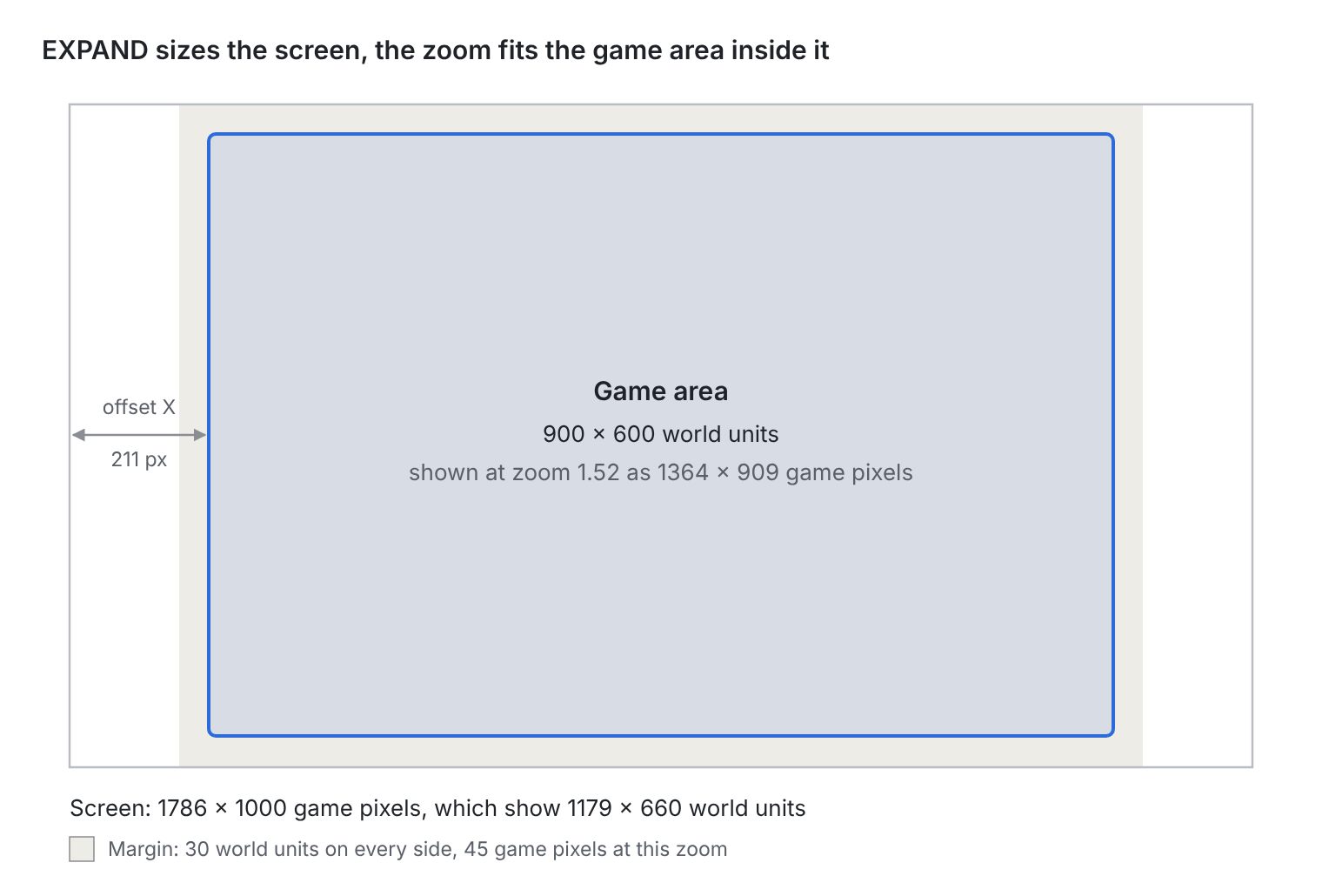
On the short side the margin touches the screen edge; on the long side the offset grows and the extra space shows more world.
The two devices from the previous table give these results:
| Game size (game pixels) | Game area (world units) | Zoom | Offset (game pixels) | Visible world (world units) |
|---|---|---|---|---|
| 1786 x 1000 | 900 x 600 | 1.52 | 211, 45 | 1179 x 660 |
| 820 x 1598 | 600 x 900 | 1.24 | 37, 240 | 660 x 1286 |
On the short side the visible world is exactly area plus two margins, 600 + 30 + 30 = 660. On the long side the player sees extra world, which only ever holds decoration: the gameplay stays inside the 900 x 600 rectangle on every device.
Pitfalls
- The first RESIZE can arrive before
create(). Phaser sends aRESIZEevent when the game is ready. A scene with nothing to preload is created just in time to hear it; a scene that loads even one image is not, and stays blank until the window changes size. Always call your resize handler once at the end ofcreate(). - Don’t resize the main camera yourself. Phaser’s camera manager listens to
RESIZEtoo, and resizes every camera that was as big as the old game size before your handler runs. Your handler only needs to set zoom and scroll. - Interface elements live in the world too. A text added with
this.add.text()is zoomed and scrolled by the main camera like everything else, so it sticks to the game area instead of the screen corner. Either place it at the visible rectangle’s corner with a scale of 1 / zoom, or give the interface its own camera with no zoom and make each camera ignore the other’s objects. - The parent must fill the screen. EXPAND measures the parent element. With only a
bodyreset, the container is as tall as the canvas and the page scrolls. Give itposition: fixed; inset: 0;. This also fixes the iOS habit of counting the address bar in100vh. - Iframes work out of the box. Inside an iframe the parent fills the iframe, not the page, and EXPAND adapts to it like to any window. Keyboard input needs the iframe to have focus, which a first tap or click gives it.
The example
The example below puts all of this on screen. It draws the game area as a frame over an endless grid, keeps it centered with its margins on any window, turns it when the screen turns, and prints every number from this post in the top left corner. Resize the window, or open it in a new page or on a phone and rotate it, and watch the numbers change while the frame never leaves the screen.
And this is the commented source code:
index.html
The web page which hosts the game, which will run inside game-container element.
<!doctype html>
<html lang="en">
<head>
<meta charset="UTF-8" />
<meta name="viewport" content="width=device-width, initial-scale=1.0" />
<link rel="stylesheet" href="/style.css">
</head>
<body>
<div id="game-container"></div>
<script type="module" src="/src/main.ts"></script>
</body>
</html>public\style.css
The cascading style sheets of the main web page.
body {
margin: 0;
padding: 0;
background: #f5f2ea;
}
#game-container {
position: fixed;
inset: 0;
}src\main.ts
Game launcher created by the official Create Game App.
import StartGame from './game/main';
document.addEventListener('DOMContentLoaded', () => {
StartGame('game-container');
});src\game\main.ts
This is where the game is created, with all Phaser related options.
import { Game as MainGame } from './scenes/Game';
import { AUTO, Game, Scale, Types } from 'phaser';
/**
* Game configuration.
*
* With Scale.EXPAND, width and height are not the final game size but the base size:
* Phaser scales 820 x 1000 to fit the screen, then extends the game size along the side
* with spare room, so there are no black bars. One side of the game size always matches
* the base size and the other one is equal or larger: 1786 x 1000 on a wide window,
* 820 x 1598 on a phone held upright. The scene reads the result in this.scale.width
* and this.scale.height, and gets a RESIZE event every time it changes.
*
* The canvas style makes the canvas a block, so no text line gap appears below it,
* and lets Phaser handle every touch instead of the browser scrolling or zooming the page.
*/
const config: Types.Core.GameConfig = {
type: AUTO,
width: 820,
height: 1000,
parent: 'game-container',
backgroundColor: '#f5f2ea',
canvasStyle: 'display: block; touch-action: none;',
scale: {
mode: Scale.EXPAND,
autoCenter: Scale.CENTER_BOTH
},
scene: [
MainGame
]
};
/**
* Starts the game.
* @param parent Id of the element that will contain the canvas.
* @returns The running game.
*/
const StartGame: (parent: string) => Game = (parent: string): Game => {
return new Game({ ...config, parent });
};
export default StartGame;src/game/scenes/Game.ts
Main file, all logic is stored here.
import Phaser from 'phaser';
/**
* Here we have a fixed game area, drawn as a frame over an endless grid,
* always fully visible and as large as possible on any screen.
*
* Two coordinate systems are involved:
* - game pixels: the game size chosen by Scale.EXPAND (this.scale.width and this.scale.height);
* - world units: the coordinates used to place objects in the game area.
* The main camera turns world units into game pixels with its zoom and its scroll.
*/
export class Game extends Phaser.Scene {
/** Long side of the game area, in world units. */
private longSide: number = 900;
/** Short side of the game area, in world units. */
private shortSide: number = 600;
/** Minimum free space between the game area and each edge of the screen, in world units. */
private minSideMargin: number = 30;
/** Size of a grid cell, in world units. */
private gridSize: number = 30;
/** Draws the grid and the frame of the game area. */
private gridGraphics: Phaser.GameObjects.Graphics;
/** Current width of the game area in world units: longSide on landscape screens, shortSide on portrait ones. */
private gameAreaWidth: number = this.longSide;
/** Current height of the game area in world units: shortSide on landscape screens, longSide on portrait ones. */
private gameAreaHeight: number = this.shortSide;
/** Game pixels per world unit: the zoom of the main camera. */
private worldScale: number = 1;
/** Distance from the left edge of the screen to the game area, in game pixels. */
private areaOffsetX: number = 0;
/** Distance from the top edge of the screen to the game area, in game pixels. */
private areaOffsetY: number = 0;
/** Shows the current sizes, pinned to the top left corner of the screen. */
private debugText: Phaser.GameObjects.Text;
constructor() {
super('Game');
}
/**
* Creates the grid and the debug text, then fits them to the screen.
*/
create(): void {
this.gridGraphics = this.add.graphics();
this.debugText = this.add.text(10, 10, '', {
fontFamily: 'monospace',
fontSize: '26px',
color: '#2f3033'
});
this.scale.on(Phaser.Scale.Events.RESIZE, this.handleResize, this);
// The scale manager may have already sent its first RESIZE event before create()
// (for example when preload() loads some files), so the first layout is done here.
this.handleResize();
}
/**
* Fits the game area to the current game size.
* Called once at start and then by Phaser every time the game size changes.
* Phaser has already resized the main camera to the new game size,
* so only its zoom and its scroll have to be set here.
*/
private handleResize(): void {
// The long side of the game area follows the long side of the screen.
const isLandscape: boolean = this.scale.width > this.scale.height;
this.gameAreaWidth = isLandscape ? this.longSide : this.shortSide;
this.gameAreaHeight = isLandscape ? this.shortSide : this.longSide;
// The largest zoom that keeps the whole game area inside the screen, margins included.
// Margins are world units like the game area, so they are zoomed together with it.
const requiredWidth: number = this.gameAreaWidth + this.minSideMargin * 2;
const requiredHeight: number = this.gameAreaHeight + this.minSideMargin * 2;
this.worldScale = Math.min(this.scale.width / requiredWidth, this.scale.height / requiredHeight);
// The space left around the game area, split equally between the two sides.
this.areaOffsetX = (this.scale.width - this.gameAreaWidth * this.worldScale) / 2;
this.areaOffsetY = (this.scale.height - this.gameAreaHeight * this.worldScale) / 2;
this.cameras.main.setZoom(this.worldScale);
this.cameras.main.centerOn(this.gameAreaWidth / 2, this.gameAreaHeight / 2);
const visibleArea: Phaser.Geom.Rectangle = this.getVisibleArea();
this.drawArena(visibleArea);
this.updateDebugText(visibleArea);
}
/**
* Returns the part of the world shown on screen. The game area goes from (0, 0)
* to (gameAreaWidth, gameAreaHeight); the margins around it have negative coordinates
* on the top and left sides, and coordinates beyond the game area on the other two.
* @returns The visible rectangle, in world units.
*/
private getVisibleArea(): Phaser.Geom.Rectangle {
const left: number = -this.areaOffsetX / this.worldScale;
const top: number = -this.areaOffsetY / this.worldScale;
const width: number = this.scale.width / this.worldScale;
const height: number = this.scale.height / this.worldScale;
return new Phaser.Geom.Rectangle(left, top, width, height);
}
/**
* Draws a grid filling the whole screen and the frame of the game area.
* Grid lines start from the center of the game area, so the grid stays symmetric
* around it whatever the screen size.
* @param visibleArea The part of the world shown on screen, in world units.
*/
private drawArena(visibleArea: Phaser.Geom.Rectangle): void {
const halfAreaWidth: number = this.gameAreaWidth / 2;
const halfAreaHeight: number = this.gameAreaHeight / 2;
// The first grid line inside the screen: the line through the center, moved back by whole cells.
const firstX: number = halfAreaWidth - Math.ceil((halfAreaWidth - visibleArea.left) / this.gridSize) * this.gridSize;
const firstY: number = halfAreaHeight - Math.ceil((halfAreaHeight - visibleArea.top) / this.gridSize) * this.gridSize;
this.gridGraphics.clear();
this.gridGraphics.lineStyle(1, 0xd5dce3);
for (let x: number = firstX; x < visibleArea.right; x += this.gridSize) {
this.gridGraphics.lineBetween(x, visibleArea.top, x, visibleArea.bottom);
}
for (let y: number = firstY; y < visibleArea.bottom; y += this.gridSize) {
this.gridGraphics.lineBetween(visibleArea.left, y, visibleArea.right, y);
}
this.gridGraphics.lineStyle(4, 0x2f3033);
this.gridGraphics.strokeRect(0, 0, this.gameAreaWidth, this.gameAreaHeight);
}
/**
* Writes the current sizes and pins the text to the top left corner of the screen.
* The text lives in the world like everything else, so the camera zooms it too:
* scaling it by 1 / worldScale cancels the zoom and keeps it at its real size.
* @param visibleArea The part of the world shown on screen, in world units.
*/
private updateDebugText(visibleArea: Phaser.Geom.Rectangle): void {
this.debugText.setScale(1 / this.worldScale);
let debugString: string = 'Camera zoom: ' + (Math.round(this.worldScale * 100) / 100).toString();
debugString += '\n\nGame size (game pixels)';
debugString += '\nWidth: ' + Math.round(this.scale.width).toString();
debugString += '\nHeight: ' + Math.round(this.scale.height).toString();
debugString += '\n\nGame area (world units)';
debugString += '\nWidth: ' + this.gameAreaWidth.toString();
debugString += '\nHeight: ' + this.gameAreaHeight.toString();
debugString += '\n\nVisible world (world units)';
debugString += '\nWidth: ' + Math.round(visibleArea.width).toString();
debugString += '\nHeight: ' + Math.round(visibleArea.height).toString();
debugString += '\n\nGame area offset (game pixels)';
debugString += '\nX: ' + Math.round(this.areaOffsetX).toString();
debugString += '\nY: ' + Math.round(this.areaOffsetY).toString();
this.debugText.setText(debugString);
}
}Here you can download the full Phaser project, powered by Vite. Don’t know what I am talking about? There’s a free minibook to get you started, and a guide to Create Phaser Game app.